 |
|
 |
|
 |
|
THIS FONT NOW AVAILABLE
THROUGH P22/LANSTON TYPE
SHOWING SOON
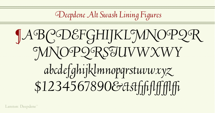
This page is not finished. The face is available now. It is very complete with roman, italic,small caps , accents ligatures and swash italic. Swash Italic is shown on the right.
|
FONT PACKAGE $69.95 US
|
|
Deepdene Roman
|
|
Deepdene Small Caps
|
|
Deepdene Italic
|
|
Deepdene It Sm Caps
|
|
|
PC & MACINTOSH FONT FORMATS
 |
|
I LANSTON TYPE COMPANY I FONT I
THE STORY OF GOUDY DEEPEDENE
¶ I told him that I could not consider the Linotype at all in the deal, as I was under contract with the [American Lanston] Monotype Company and could not draw for any composing machine other than the Monotype; but if he would get Mr. Best's consent I would let him have the design. This Best would not agree to; he was, in fact, quite angry with me, as he had the impression I was willing to dicker with the Linotype Company contrary to the business arrangement between the Monotype and me.
When I explained that I had only agreed to sell to Rudge personally (and did not then know that he was a typographic consultant of the Linotype), Best asked if I would give Monotype (Lanston Monotype Machine Company) the reproduction rights for which he would make me a liberal advance on royalties. This arrangement suited me and the first sales of matrices were very satisfactory.
I have always resented the fact that when Deepdene was put on the Monotype machine I was not asked to cooperate in adapting the individual characters to the die-case, for I feel that the slight changes made do not always carry out my own ideas as to the changes necessary, or as to the fitting of those changed characters.
When Simon & Shuster issued their edition of The Bible as Living Literature they used Deepdene and its italics, but the publisher's note about the design of the type seems to me to suggest that my design was somehow at fault. It states that the book 'is set in 14-point Deepdene, a contemporary book face designed by Frederic W. Goudy for the Lanston Monotype Machine Company, Philadelphia, Pennsylvania. Many of the characters have been recut and refitted for the special purposes of this text."
In the first place Deepdene was not designed for the Monotype, (American Monotype) as I have said; I made it for my own use and sale to printers, and for this purpose I cut the first matrices. I presume the note on the S. & S. Bible specifically means that the changes were made to adapt the face to the die-case, but it reads as though the Monotype or the publishers felt it necessary or desirable to improve my design. At any rate I am glad the use of it did not prevent the publishers from selling several hundred thousand copies of the Good Book!
FREDERIC GOUDY
Type Designer
 |
|
 |
|
GOUDY, DEEPDENE
FREDERIC GOUDY